Wednesday, September 29, 2010
Alexx Smith, Concentration 2.
Tuesday, September 28, 2010
Monday, September 27, 2010
Thursday, September 23, 2010
Megan Schlosser, Detail Portrait
I choose to photograph this necklace because my sister's birth stone and my birth stone are inside of the girls dresses. My sister is a big part of me, this is why I decided to incorporate her into MY detail portrait.
Wednesday, September 22, 2010
Bailey Hayek- Detail Portrait
This image represents that I love to dance and it also shows that I am a happy person by being bright and colorful (:
Geck: Detail Portrait
Each image in the detail portrait shoot is meant to represent something about the photographer. This photograph of my piccolo represents my love of being in band and making music.
Guerra- Detail
From the detail shoot.
The objective of this assignment was to photograph things that best portray ourselves.
This is me in a nutshell.
Tuesday, September 21, 2010
Rachel Wolford "Space Between"
This picture is based off a song called Space Between by: Valencia. The lyrics are "blue sky sunrise and all the space between." The guy in the song is using drinking to get over his ex and the light color at the top is the girl being the good and the color in the bottom represents the guys true side while the dark represents how his excessive drinking has taken over him.
Monday, September 20, 2010
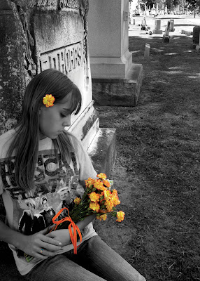
Kaytlynn Chism-- Graveyards (photo 3)
Image of my friend sitting at a graveyard with a bouquet of flowers. Used selective color to just bring out the color of the flowers.
Friday, September 17, 2010
Alexx Smith, Concentration 1.
This photoshoot was based on the theme of portraying real life activites (such as interacting with ways of transportation) with toys replacing the object the person is interacting with.
The editing made me want to tear my hair out.
Bridget Harrah, Proportion.
This image represents proportion by the flower being larger than the other flowers in the background.
stevens, amber design principles shoot-(proprtion)
This is an example of proportion because the objects are two different sizes. the clothes pins are closer to the camera.
Bailey Hayek- Design Principle (Variety)
The different color crayons show variety and this image also shows the compositional technique of line dominance.
Subscribe to:
Posts (Atom)


